
In 2025, exterior house colors are leaning towards natural and warm tones that blend well with the environment. Earthy sage green is becoming very popular because it connects homes to nature and works nicely with white trims or wood accents, especially for craftsman or cottage styles. Soft orange shades add unexpected warmth, perfect for Mediterranean or southwestern homes. Rich charcoal gray makes a bold statement when paired with metallic accents, while brown tones are replacing black as dramatic yet cozy options. Blues offer a serene coastal vibe, and warm neutrals like beige or greige remain timeless choices. Testing samples under different lighting is key before making a final decision.
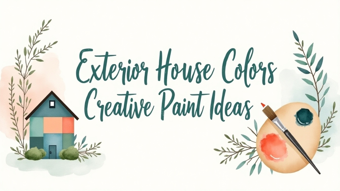
Table of Contents
- Most Popular Exterior House Color Trends for 2025
- Behr’s 2025 Curb Appeal Collection and Paint Themes
- Top 45 Exterior House Paint Colors with Descriptions
- Tips for Choosing the Perfect Exterior Paint Color
- Creative Ways to Use Accent Colors on Your Home
- How to Pair Paint Colors with Architectural Styles
- Combining Earth Tones with Natural Materials
- Using Vibrant Colors to Add Personality
- Balancing Warm Neutrals and Greiges for Timeless Looks
- Metallic and Unique Paint Accents for Modern Elegance
- Practical Advice on Paint Testing and Preparation
- Maintaining Your Exterior Paint for Long-Lasting Beauty
- Color Combinations to Enhance Curb Appeal
- Warm Whites and Their Versatility on Different Homes
- Using Blues for Coastal and Suburban Charm
- Incorporating Rich Browns as Alternatives to Black
- Soft Oranges for Inviting Southwestern and Mediterranean Vibes
- Choosing Grays to Create Sophisticated Modern Exteriors
- Blending Purples and Pinks for Subtle Vintage Touches
- The Role of Natural Light in Exterior Color Appearance
- How to Use Paint to Highlight Architectural Details
- Matching Trim and Fixtures with Exterior Paint Colors
- Color Trends That Reflect Nature and Warmth
- When and How Often to Repaint Your Home Exterior
- Using Paint to Create a Cohesive Neighborhood Look
- Accent Ideas with Door and Shutter Colors
- Warm Earth Tones That Suit Various Climates
- Layering Neutral Palettes for Depth and Interest
- Popular Paint Brands and Their Signature Shades
- Designing with Contrast: Light Trims and Dark Walls
- Incorporating Copper and Gold Fixtures with Exterior Paint
- How to Adapt Trends to Traditional and Modern Homes
- Customizing Exterior Colors for Personal Style
- The Impact of Paint Finish on Overall Appearance
- Mixing Bold and Subtle Colors for Balanced Exteriors
- Using Paint to Complement Roofing and Landscaping
- Highlighting Craftsmanship with Color Choices
- Using Color to Make Small Homes Feel Larger
- Exterior Paint Ideas for Urban and Rustic Homes
- Creative Paint Combinations for Front Doors
- Avoiding Common Exterior Paint Mistakes
- How to Use Sample Testing Effectively
- Choosing Paint for Durability in Harsh Weather
- Frequently Asked Questions
44.1. How do I choose the best exterior house color that matches my home’s style and surroundings?
44.2. What are some creative ways to combine multiple paint colors on my house exterior without it looking overwhelming?
44.3. How can exterior paint colors influence my home’s curb appeal and resale value in 2025?
44.4. What are some popular exterior house color trends for 2025 that offer both style and durability?
44.5. How should I prepare my home’s exterior surface before applying creative paint ideas to ensure a smooth finish?
Most Popular Exterior House Color Trends for 2025
In 2025, exterior house color trends lean into warm, natural tones that create a sense of comfort and connection to the environment. Earthy Sage Green stands out as a top choice, offering a muted, adaptable shade that works well with white trims or warm wood accents. This color suits cottage and craftsman-style homes, blending seamlessly with natural surroundings. Soft Orange hues like Subdued Sienna and Spiced Cider are gaining popularity for their warm, inviting charm. These shades fit southwestern, Mediterranean, and contemporary homes, especially when paired with cream or beige trims and contrasted by deep grays for added depth. Rich Charcoal Gray provides a bold yet elegant look, complementing materials such as wood, stone, and brick. Accents in copper or gold fixtures and lighter trims like Snowbound or Alabaster enhance its sophisticated appeal. Warm Browns, including Urbane Bronze and Deep Creek, are replacing black as dramatic but inviting alternatives, fitting urban, rustic, or transitional styles, often balanced by warm white trims. Blues such as Boothbay Gray and Needlepoint Navy offer breezy, friendly exteriors perfect for coastal or suburban settings, typically combined with white accents or warm wood features. Warm Neutrals like Accessible Beige and Shaker Beige continue to be reliable, cozy bases that suit a wide range of architectural styles and climates. Greiges, blending gray and beige, bring a sophisticated, timeless feel to both modern and traditional homes, usually paired with crisp or soft whites. Warm Whites including Simply White and Ballet White remain classic and versatile choices adaptable from farmhouse to coastal designs. A key tip for 2025 is to test color samples in different lighting conditions before committing, as natural light and surrounding elements can significantly affect how a color appears. Overall, the trend favors colors that emphasize warmth, longevity, and a natural, organic connection, moving away from stark contrasts toward more inviting, earthy palettes.
| Color Family | Sample Colors (Brands) | Description / Use Case |
|---|---|---|
| Earthy Greens | Sage Green (Sherwin-Williams Evergreen Fog), Ashen Green, Jade Green | Calming, nature-inspired tones ideal for cottage and craftsman homes; connects home to nature, pairs well with white trim or warm wood accents. |
| Warm Oranges | Soft Orange (Subdued Sienna, Spiced Cider) | Warm, soft chalky orange tones suited for southwestern, Mediterranean, and contemporary homes; best with cream or beige trims and deep gray contrasts. |
| Grays & Greiges | Charcoal Gray (Benjamin Moore Chelsea Gray, Sherwin-Williams Gauntlet Gray), Agreeable Gray, Revere Pewter | Bold and elegant modern neutrals; versatile on traditional and modern homes; pairs well with white trims and metallic accents. |
| Browns | Urbane Bronze (Sherwin-Williams), Deep Creek, Black Fox (Benjamin Moore) | Warm, dramatic browns replacing black as a popular dark shade; fitting urban, rustic, and transitional homes; often paired with warm white trims. |
| Blues | Boothbay Gray, Needlepoint Navy, Palladian Blue | Breezy, inviting blues ideal for coastal and suburban settings; balanced with white accents or warm wood elements. |
| Warm Neutrals | Accessible Beige (Sherwin-Williams), Shaker Beige (Benjamin Moore), Wool Skein | Cozy, timeless neutrals that adapt to various architectural styles and climates; provide versatile and inviting backgrounds. |
| Warm Whites | Simply White, Ballet White (Benjamin Moore), Alabaster, Swiss Coffee | Classic, clean, and timeless whites; versatile for farmhouse, coastal, traditional designs; good for siding or trims. |
| General Tips | , | Testing color samples under different lighting is essential. Trending palettes emphasize warmth, longevity, and organic connection to nature. |
Behr’s 2025 Curb Appeal Collection and Paint Themes
Behr’s 2025 Curb Appeal Collection offers 45 thoughtfully curated colors organized into four architectural themes: American casual, Craftsman, Modern, and Traditional. This collection leans into warm, authentic tones inspired by nature, moving away from the cooler grays and beiges that have dominated recent years. The Color of the Year, Cedar, embodies earthy warmth with subtle versatility, drawing inspiration from cedarwood to create exteriors that feel both rustic and refined. Instead of stark black and white farmhouse palettes, the collection embraces rich earth tones alongside vibrant accent colors like yellow, teal, and orange to add personality and depth. Dark shades such as black, charcoal gray, and dark blue are paired with lighter natural colors, providing contrast without overpowering the home’s character. Whether tackling a full exterior renovation or simply refreshing front doors and window trims, these colors support a range of updates that highlight warmth and personal style. The palette encourages mixing traditional shades with modern design elements to achieve a balanced, inviting look that connects well with natural materials and surroundings. Homeowners are invited to explore combinations that reflect their taste while honoring their home’s architectural roots, reinforcing a genuine sense of place and timeless curb appeal.
Top 45 Exterior House Paint Colors with Descriptions
Choosing the right exterior paint color can transform the look and feel of your home, setting the tone for its style and atmosphere. Alpine White offers a crisp, clean, and highly versatile base that suits many architectural styles, making it a safe and fresh choice for exteriors. For a touch of sophistication with calming cool undertones, Arctic Gray is ideal, especially for modern homes seeking understated elegance. Ashen Green brings a muted, nature-inspired vibe that creates a tranquil atmosphere, perfect for cottage or craftsman homes nestled in greenery. If warmth and drama are what you want, Autumn Red delivers rich, vibrant tones that complement traditional and rustic aesthetics beautifully. Beige Cream stands out as a soft and cozy classic neutral, providing universal appeal and inviting warmth to any facade.
Biscuit Tan gives warmth and timeless comfort, blending effortlessly with natural surroundings, making it a great pick for homes aiming to harmonize with their landscape. Black Onyx makes a bold, deep, and elegant statement, adding drama to contemporary designs while maintaining sophistication. Blue Horizon offers a serene and refreshing feel, ideal for coastal or suburban homes looking to evoke calm and relaxation. Brick Red reflects warm, earthy nostalgia, enhancing traditional architecture with its rich tones. Adding a touch of luxury, Bronze Gold mixes bronze and gold hues to create stunning accents that elevate any exterior.
Caramel Swirl features warm caramel hues with subtle variations, adding visual interest without overwhelming. Charcoal Gray is a modern, sleek, and sophisticated choice that pairs well with light trims and metal accents, perfect for homeowners wanting a refined look. Chestnut Brown brings a warm, rustic wood-like appeal, grounding homes in natural charm. Coastal Blue evokes the sea with tranquil and refreshing vibes, great for homes near water or those wanting a breezy feel. Creamy Peach adds a soft, inviting touch with cheerful warmth that feels both gentle and welcoming.
Desert Sand captures earthy, warm desert tones that blend seamlessly with natural landscapes, lending a grounded look. Dove Gray offers a soft, elegant, and calming neutral that is balanced enough to work with many styles. Earthy Olive naturally blends with the surrounding landscape, creating inviting and grounded exteriors. Ebony Black delivers a bold, dramatic presence, ideal for contemporary or urban homes aiming to stand out. Forest Green is deep and nature-evoking, adding richness and sophistication to exterior palettes.
French Gray, inspired by classic French architecture, is soft and warm, providing timeless appeal. Goldenrod Yellow introduces vibrant, cheerful brightness that works well for accent areas needing a sunny boost. Harbor Mist is a light neutral gray that creates a calming, subtle backdrop without drawing too much attention. Ivory Lace offers a soft, delicate option perfect for timeless and understated elegance. Jade Green, bright and refreshing, brings gemstone-inspired personality and energy to any exterior.
Lavender Frost introduces delicate, calming lavender hues, offering a subtle but unique touch for those looking for something different. Lemon Sorbet is a vibrant, uplifting yellow that energizes and adds warmth, especially useful as an accent or front door color. Light Taupe is a versatile warm neutral, adaptable to various styles, making it a practical choice for many homeowners. Mellow Yellow provides a soft, muted sunny yellow that adds gentle cheerfulness without overpowering. Midnight Black delivers deep intensity for a mysterious and striking exterior look.
Mocha Brown, with warm coffee-inspired tones, feels inviting and rich, perfect for creating cozy curb appeal. Mossy Green is muted and earthy, blending naturally with surrounding greenery for a subtle, nature-connected look. Navy Blue is deep, classic, and commanding, suited for both traditional and modern homes wanting a timeless color. Nutmeg Brown reflects warm, earthy spice tones that enhance rustic settings with a comforting presence. Ocean Teal combines blue and green vibrancy, creating refreshing coastal vibes that stand out without being loud.
Pale Pink offers light, subtle vintage charm and softness, adding a delicate touch to exteriors. Pebble Gray balances gray with beige undertones, delivering a warm, neutral look that works well in many settings. Plum Purple is cool and complex, providing eye-catching accents for those wanting to introduce cooler tones with personality. Pumpkin Spice brings warm, vibrant terracotta tones for lively, earthy homes that feel full of life. Rich Burgundy blends deep red with purple and brown hues, offering dramatic warmth for bold exterior statements.
Rustic Orange is earthy and warm, delivering nostalgic autumn appeal that suits southwestern or country homes. Sandy Beige is light and warm, inspired by beach tones to create relaxed and inviting exteriors. Seafoam Green evokes ocean softness, adding tranquility and a fresh coastal feel. Silver Gray incorporates neutral tones with a subtle metallic shine, perfect for modern elegance and understated glamour. Slate Blue is a muted blue with gray undertones, versatile and calming, suitable for a wide range of exterior styles.
Tips for Choosing the Perfect Exterior Paint Color
Choosing the right exterior paint color starts with understanding your home’s architectural style. For example, Victorian houses can handle vibrant, bold hues that highlight their intricate details, while modern homes typically benefit from minimalist palettes with clean, muted tones. Testing paint samples directly on different parts of your house is essential. Observe these samples at various times of the day since natural light can dramatically change how a color appears. Also, consider your home’s surroundings: the natural landscape, neighboring houses, and local climate should all harmonize with your color choice to maintain a cohesive look. Pay close attention to undertones in your chosen colors, knowing whether a shade leans warm or cool helps it complement existing materials like brick, stone, or wood. Coordination with roofing, windows, trim, and doors is equally important to create a unified appearance. Proper surface preparation, cleaning, scraping old paint, and priming, ensures the paint adheres well and lasts longer. Selecting paint formulated for your local climate is crucial to resist fading, moisture, and temperature fluctuations. Investing in high-quality paint not only improves durability but also maintains color vibrancy over time. When mixing bold accent colors with neutral bases, aim for balance to add personality without overwhelming the design. Applying basic color theory, such as using complementary or analogous colors, can help create pleasing and harmonious combinations that enhance your home’s curb appeal.
- Match paint colors to the architectural style; Victorian homes can handle vibrant hues while modern designs benefit from minimalist palettes.
- Test paint samples on different areas of the house, observing them at various times of day to see how natural light affects the color.
- Consider the home’s surroundings including nature, neighboring houses, and climate to ensure harmony and appropriateness.
- Focus on undertones in colors, distinguishing between warm and cool shades to complement existing materials and finishes.
- Ensure the paint colors coordinate well with roofing, windows, trim, and doors for a cohesive look.
- Prepare surfaces properly before painting by cleaning, scraping old paint, and priming to ensure longevity and finish quality.
- Choose paint formulated for the local climate to resist fading, moisture, and temperature changes.
- Invest in high-quality paints that provide durability and maintain color vibrancy over time.
- Balance bold accent colors with neutral bases to avoid overwhelming the design while adding personality.
- Use color theory principles such as complementary and analogous colors to create pleasing combinations.
Creative Ways to Use Accent Colors on Your Home
Accent colors are key to adding depth and personality to your home’s exterior without overwhelming the overall look. Soft orange tones work beautifully on shutters, doors, or trim, bringing warmth and a subtle pop that complements many base colors. For a modern and elegant vibe, consider a charcoal gray base paired with metallic copper or gold accents on gutters, light fixtures, or house numbers, this combination feels sleek but inviting. Rich brown hues combined with warm white trim and doors create a cozy atmosphere that suits both rustic and urban styles. If you want a splash of vibrancy, small touches of teal, yellow, or orange on front doors or window surrounds can inject character without dominating the facade. Layering different shades of greige offers a sophisticated monochromatic palette, especially when highlighted with crisp white accents. Pairing earth tones with natural materials like stone, wood, and brick enhances the organic feel and texture of your exterior, perfect for homes aiming for harmony with their environment. Blues work well for coastal or suburban settings, especially when matched with white trim to evoke freshness and calm. Using warm neutrals as a base sets a timeless, inviting stage for any accent color. Finally, don’t shy away from metallic paint accents such as bronze gold or silver gray on architectural details to add subtle luxury, or pastel accents like pale pink or lavender frost on porches and railings for a touch of vintage charm. These creative uses of accent colors help your home stand out while maintaining balance and style.
How to Pair Paint Colors with Architectural Styles
Choosing the right paint colors to match your home’s architectural style can enhance its character and curb appeal. Craftsman homes work well with earthy greens, warm browns, and natural tones that highlight their wood and stone details. For example, a muted sage green or a rich chestnut brown draws attention to handcrafted features without overpowering them. Modern houses benefit from sleek charcoals, grays, and bold accent colors, such as deep charcoal walls paired with vibrant door colors, creating a clean and striking look. Victorian and traditional styles lend themselves to richer, deeper colors like burgundy, plum, or navy blue, which look stunning when paired with contrasting white or cream trims to emphasize ornate details. Coastal homes naturally suit shades of blue, seafoam green, and warm whites, reflecting the surrounding environment and evoking a breezy, relaxed vibe. Southwestern and Mediterranean designs often use warm oranges, terracotta, and sandy beiges to echo regional landscapes, with soft orange accents adding warmth without overwhelming the facade. Farmhouses are classic with warm neutrals, greiges, and soft whites that create a welcoming and timeless appearance. Rustic homes blend seamlessly into their natural surroundings with natural browns, mossy greens, and muted earth tones. Contemporary homes often embrace metallic accents and high-contrast colors to highlight sharp architectural lines, such as pairing silver gray with black or bold color pops. Colonial styles usually stick to classic palettes like navy, white, and brick red, with subtle variations in trim to maintain a refined, traditional look. Transitional homes offer flexibility by combining traditional warm grays with brighter, modern door colors, blending old and new to suit diverse tastes. Always consider how natural light affects color on your home, and test samples on different sections before committing to ensure the colors complement both the style and setting.
Combining Earth Tones with Natural Materials
Earth tones like sage green, desert sand, and chestnut brown work especially well when paired with natural materials such as stone, brick, or wood. These combinations create a seamless look that feels grounded and organic. Using warm neutrals as a base color helps highlight the texture and subtle color changes found in natural materials, adding depth without overpowering the design. For example, pairing a rich nutmeg or mocha brown with lighter wood or stone elements introduces a balanced contrast that feels warm yet dynamic. Accent colors like mossy green or rustic orange can be used thoughtfully to echo the surrounding landscape, bringing a sense of cohesion between the home and its environment. Beige and taupe tones, when matched with natural wood trims or decks, soften the overall appearance and foster a harmonious feel. It’s also important to consider how weathering will impact both paint and materials over time, ensuring the colors age gracefully together. Choosing matte or satin finishes tends to complement the rougher, organic textures of natural materials better than glossy options, which can look out of place. Layering multiple earth tones across different architectural elements adds dimension without clashing, while coordinating roof colors with earth tones helps unify the entire exterior. For homes with bold paint choices, natural stone or wood accents can ground the look, balancing vibrancy with earthy warmth. This approach not only respects the natural environment but also keeps the exterior feeling timeless and inviting.
Using Vibrant Colors to Add Personality
Incorporating vibrant colors into your home’s exterior is a smart way to inject personality without overwhelming the overall design. Consider using bold hues like goldenrod yellow, lemon sorbet, or zesty lime for front doors to create eye-catching focal points that welcome guests with cheerful energy. For a subtler approach, teal or ocean teal accents on shutters and window boxes can add fresh character to neutral main walls, offering a lively contrast that feels modern yet inviting. Secondary elements like porch railings or trim can benefit from warm tones such as pumpkin spice or rustic orange, which bring seasonal warmth and work well year-round. To keep the look balanced, it’s best to pair these vibrant accents with muted or neutral body colors, preventing the palette from becoming too busy. Extending these colors into your landscaping, through planters or porch furniture, helps unify the exterior and makes the vibrant choices feel intentional and cohesive. When selecting bold shades, always consider your neighborhood’s style to ensure your choices stand out tastefully rather than clash. For unique, artistic touches, vibrant purples or plums can be used sparingly on unexpected details like mailbox posts or decorative trims. Pairing bright colors with metallic features such as bronze or silver hardware adds depth and richness, elevating the overall aesthetic. Techniques like color blocking can help separate these vivid hues visually, maintaining harmony across the exterior. Finally, test vibrant colors on larger surfaces before committing, as lighting and architectural style can dramatically affect how these colors perform in real life.
Balancing Warm Neutrals and Greiges for Timeless Looks
Warm neutrals like Accessible Beige and Shaker Beige serve as excellent base colors for exterior walls, creating a soft and inviting atmosphere that feels both cozy and approachable. To elevate this foundation, greiges such as Agreeable Gray and Revere Pewter bring in a subtle sophistication and depth without overwhelming the design. Pairing these warm neutrals with crisp white trims offers a clean, classic contrast that keeps the look fresh and well-defined. For added dimension, layering different greige tones on varied architectural elements, like shutters, columns, or gables, adds visual interest while maintaining harmony throughout the exterior. Incorporating natural wood accents alongside this palette enhances the organic warmth, blending modern elegance with an earthy touch. It’s important to avoid overly cool grays, especially in warm climates, as they can feel harsh and out of place. Selecting paints with balanced undertones ensures the warm neutrals and greiges complement each other seamlessly. These color combinations create versatile exteriors that age gracefully and adapt well to evolving trends. For a subtle lift in elegance, muted metallic accents like bronze or soft gold can be introduced through fixtures or hardware. Always test samples in different lighting conditions to confirm the warmth and balance before committing to the full application, as natural light can greatly influence the final appearance.
Metallic and Unique Paint Accents for Modern Elegance
Adding metallic accents to your home’s exterior offers a refined way to bring modern elegance without overwhelming the design. Bronze gold details on gutters, house numbers, and fixtures introduce a sense of luxury and warmth that pairs beautifully with rich charcoals or deep blues, creating striking yet balanced contrasts. Silver gray metallic tones work well on trims or architectural features, providing a subtle shine that enhances sophistication without stealing focus. Using metallic paints sparingly is key; small touches like door hardware or light fixtures can highlight unique textures or structural elements effectively. For a contemporary look, combining these metallic accents with natural materials such as stone and wood creates a harmonious blend of warmth and sleekness. Opting for matte or satin finishes helps maintain an understated elegance by minimizing glare while showcasing the metallic sheen. Experimenting with copper or gold tones against cool gray or blue bases can add inviting warmth and depth. Before final application, always test metallic paints in natural light to observe subtle reflections and variations, ensuring the accents complement the main color scheme and architectural style seamlessly.
Practical Advice on Paint Testing and Preparation
Before committing to an exterior paint color, testing samples on different parts of your home is essential. Large swatches work better than small patches because they give a clearer sense of how the color looks on the actual surface. Natural light changes throughout the day, so observe your samples in the morning, midday, and evening to catch any shifts in tone or brightness. Keep in mind fixed elements like your roof, trim, doors, and landscaping as these will affect how the color reads overall. Preparation is just as important as choosing the right color. Start by cleaning and scraping away any loose paint, then wash off dirt and grime. Repair any surface damage to ensure a smooth finish. Use a primer compatible with your paint type; this helps the paint stick properly and shows the true color underneath. High-quality, exterior-grade paints are worth the investment since they resist weather damage and fading better over time. When applying, allow each coat to dry fully before adding the next to keep your finish even and consistent. If you are unsure about bold or vibrant colors, try starting with neutral base shades first to test undertones and how they work with your home’s texture and lighting, as paint can appear lighter or darker depending on these factors.
Maintaining Your Exterior Paint for Long-Lasting Beauty
To keep your exterior paint looking fresh and vibrant, inspect painted surfaces at least once a year for signs of peeling, cracking, or blistering. Clean your home gently using mild soap and water to remove dirt and mildew without damaging the paint. Avoid high-pressure power washing, which can strip paint and harm siding. Trim trees and bushes near your house regularly to prevent moisture buildup and physical damage to painted surfaces. Areas exposed to strong sun, rain, or wind may need repainting or touch-ups more often, as these conditions cause faster wear. Choosing paints with UV resistance helps reduce fading caused by sunlight. Seal and caulk any gaps or cracks to stop water from seeping in, protecting both the paint and the materials underneath. Maintaining gutters and downspouts is also important to prevent water runoff from damaging painted walls. When storing leftover paint for future use, keep it in a cool, dry place with a tightly sealed lid to preserve its quality. Depending on your local climate, paint type, and the condition of your house, plan to repaint every 5 to 7 years to maintain curb appeal and protect your home.
Color Combinations to Enhance Curb Appeal
Choosing the right color combinations can significantly boost your home’s curb appeal by highlighting its architectural features and creating a welcoming atmosphere. Pairing earthy greens with crisp white trim offers a fresh, natural look that works well with many styles, especially craftsman or cottage homes. Warm whites combined with rich browns create cozy, inviting exteriors that feel grounded and timeless. For a touch of southwestern or Mediterranean charm, soft orange accents set against neutral beige or taupe bases add warmth without overwhelming the senses. Charcoal gray walls take on a sophisticated edge when accented with metallic touches like copper or gold fixtures, lending modern elegance to any facade. Blues paired with warm wood tones or white trims evoke a coastal or suburban vibe, perfect for tranquil, breezy settings. Greige, a balanced mix of gray and beige, serves as a versatile backdrop that harmonizes with both cool and warm accent colors, making it ideal for traditional or contemporary homes. Adding subtle purples or pinks as secondary colors introduces gentle vintage or whimsical elements without dominating the palette. Incorporating natural materials such as stone or brick alongside earth-toned paints creates a seamless connection to the environment. To make architectural details stand out, use contrasting but complementary colors on shutters, doors, and window frames. Applying principles of color harmony, like complementary or analogous schemes, ensures a balanced and visually appealing exterior that enhances your home’s unique character.
Warm Whites and Their Versatility on Different Homes
Warm whites, with their subtle undertones of cream, beige, or soft yellow, offer a softer alternative to pure white, making them highly versatile for various home styles. Their timeless appeal suits farmhouse, coastal, craftsman, and traditional homes, creating an inviting and clean look that feels neither too stark nor cold. These shades, like Simply White, Ballet White, Alabaster, and Swiss Coffee, work well on siding or trim, providing an excellent backdrop that highlights front doors or shutters in bolder hues. Warm whites gently reflect natural light, enhancing curb appeal without harsh glare, and they also mask dirt and imperfections better than cooler whites, which is a practical benefit in many climates. On smaller homes, warm whites can visually enlarge spaces by creating a sense of openness through light reflection. They pair beautifully with bold accent colors and natural materials such as wood or stone, and coordinate smoothly with warm neutrals, browns, and soft grays, allowing for layered, sophisticated palettes that adapt well to different environments.
Using Blues for Coastal and Suburban Charm
Blues bring a natural sense of calm and freshness, making them perfect for homes near the coast or in quiet suburban neighborhoods. Light blue shades paired with crisp white trim offer a timeless seaside vibe, creating an airy and inviting atmosphere that feels both classic and relaxed. For a more dramatic look that still respects tradition, deeper blues like navy or needlepoint navy add depth without overpowering the overall design. Incorporating natural wood accents alongside blue tones introduces warmth and texture, balancing the coolness of blue and adding an organic touch. Soft blues blend beautifully with green landscaping and the open sky, helping homes harmonize with their surroundings instead of standing out harshly. Popular blue choices such as Boothbay Gray, Palladian Blue, and Coastal Blue provide versatile options that suit a variety of architectural styles. To bring personality without overwhelming the facade, consider accenting doors or shutters with contrasting blue shades. Blues also pair well with beige or warm white trims, delivering a clean, balanced look that appeals widely. In neighborhoods, blue hues allow homes to stand out gently and elegantly, avoiding clashes with neighboring houses. When selecting the right blue, it’s important to observe how natural light interacts with the color and how shading from nearby trees may affect its appearance, ensuring the paint neither looks dull nor too bright throughout the day.
Incorporating Rich Browns as Alternatives to Black
Rich brown shades are gaining popularity as a warm, inviting alternative to black for home exteriors. Unlike black, which can feel stark or harsh, browns add depth and coziness without sacrificing drama. Shades such as Urbane Bronze, Black Fox, and Deep Creek offer modern, earthy tones that work well on urban, rustic, craftsman, or transitional homes aiming for a bold yet welcoming look. Browns pair beautifully with warm white trims, providing just the right contrast to soften the overall appearance. These hues also blend naturally with materials like wood, stone, and brick, enhancing the organic feel of the exterior. Another practical benefit is that brown exteriors tend to show less dust and dirt compared to black, which means less frequent cleaning and maintenance. Whether used across the entire siding or as an accent on doors, shutters, or trim, brown tones can create a sophisticated statement. For added elegance, pairing rich browns with metallic accents in bronze or copper brings a subtle shine and detail that elevates curb appeal. Layering these colors with warm neutrals or greiges helps build a comfortable, textured palette that feels both timeless and fresh.
Soft Oranges for Inviting Southwestern and Mediterranean Vibes
Soft orange tones bring a warm, cheerful personality to exterior walls and accents, making them a perfect choice for southwestern and Mediterranean styles. Shades like Subdued Sienna, Spiced Cider, and Pumpkin Spice evoke the sun-warmed earth and traditional architecture found in these regions. Instead of overwhelming an entire facade, soft orange works beautifully on shutters, doors, or trim, adding subtle pops of color that enhance the home’s character. Pairing these hues with cream, beige, or warm white balances their vibrancy, creating an inviting and harmonious look. These oranges complement natural stone, terracotta roof tiles, and desert landscaping, blending the home seamlessly with its surroundings. For a modern take on southwestern style, soft orange contrasts nicely with deep gray or charcoal accents, adding depth and sophistication. Highlighting architectural features like arches, columns, or window boxes with soft orange shades draws attention to craftsmanship and detail. When combined with natural wood tones and lush green plants, soft oranges complete a rich, warm palette that feels welcoming and timeless, especially in warm climates where such colors naturally resonate.
Choosing Grays to Create Sophisticated Modern Exteriors
Gray has become a go-to choice for modern home exteriors because it offers a neutral, versatile base that suits many architectural styles. Darker shades like charcoal gray bring a bold and elegant statement, giving a home a polished, sophisticated look. On the other hand, lighter grays such as Agreeable Gray or Revere Pewter introduce subtle sophistication without overwhelming the design. Popular grays like Chelsea Gray and Pebble Gray also provide balanced warmth and neutrality, making them easy to pair with other elements.
Pairing gray exteriors with crisp white or cream trims is a classic way to highlight architectural lines and create clean contrasts. Adding natural materials like wood or stone accents softens the modern edge, infusing warmth and texture that prevent the facade from feeling cold or flat. Metallic touches in silver or brushed nickel complement gray tones beautifully, lending a sleek, contemporary finish that feels fresh and refined.
It’s important to consider gray’s undertones carefully, as they can lean cooler or warmer depending on the shade and lighting. Testing samples on your home’s exterior before committing helps avoid unexpected results. Using darker grays strategically, such as on accent walls or entryways, can establish focal points and depth, enhancing curb appeal.
For those wanting to introduce personality, gray pairs well with vibrant accent colors like yellow, teal, or warm orange. This approach keeps the main color neutral and timeless while allowing pops of energy that reflect individual style. Whether your home is urban, craftsman, or contemporary, gray provides a polished, timeless foundation that adapts well to evolving trends and stands out with understated confidence.
Blending Purples and Pinks for Subtle Vintage Touches
Soft purples and pale pinks like Lavender Frost, Pale Pink, Plum Purple, and Vintage Rose bring a gentle charm and vintage character to home exteriors without overpowering the design. These colors work best as accents on shutters, doors, or decorative trim, adding subtle interest and a delicate palette that complements whites, creams, and light grays to maintain a soft, inviting look. They evoke nostalgic or whimsical feelings, making them ideal for cottage-style or historic homes. Pairing pastel purples with natural wood tones or stone creates a balanced warmth that prevents the colors from feeling too cool or stark. Since these hues can be easily overwhelmed, it’s best to avoid painting large surfaces with them; instead, use them sparingly to highlight architectural details. These shades also coordinate beautifully with floral landscaping and lush greenery, enhancing curb appeal and offering a refreshing alternative to the common neutral palettes in many neighborhoods. Keep in mind that purples and pinks can shift dramatically under different lighting conditions, so testing samples throughout the day and evening is important to ensure the desired effect is achieved.
The Role of Natural Light in Exterior Color Appearance
Natural light plays a crucial role in how exterior paint colors appear throughout the day and across different weather conditions. Morning light, which tends to be cooler and softer, often mutes warm colors like soft oranges and yellows, while it brightens cooler tones such as blues and grays. By midday, the sun offers bright and neutral light that reveals colors more accurately, though it can sometimes cause glare on lighter paints, making them appear washed out. Evening or sunset light adds warmth, intensifying yellows, oranges, and reds, but this same light can dull cooler shades like blues and grays. Shaded areas also affect perception, generally making colors look darker or cooler compared to direct sunlight. On overcast days, diffuse light softens colors and reduces shadows, creating a more uniform but sometimes flatter appearance. The direction your house faces is important to consider since south-facing walls receive more direct light, changing how colors are seen compared to north-facing sides. Surrounding elements such as trees, neighboring buildings, or reflective surfaces further influence light and color perception, which is why testing paint samples on all sides of your home at different times of day is essential. This practice helps ensure the chosen colors maintain the desired look under your local climate’s typical lighting conditions, whether it’s a warm afternoon glow or a cooler, shaded morning. For example, an earthy sage green might appear vibrant and welcoming in the soft morning light but take on a deeper, more muted tone in shaded areas. Understanding these shifts helps you select exterior colors that harmonize with your home’s environment and architectural style throughout the changing light of each day.
How to Use Paint to Highlight Architectural Details
To truly bring out the character of your home, start by identifying key architectural features such as moldings, trims, columns, and window frames. These elements provide natural focal points that can be accentuated with paint. Using contrasting colors is a simple yet effective way to make these details pop against the main body of the house. For example, pairing light trims in warm whites or soft creams with darker walls, like charcoal gray or rich browns, creates sharp definition and a timeless appeal. Accent colors like soft orange or deep browns work well on doors and shutters to draw attention without overwhelming the overall look. It’s important to choose durable, high-quality paint suited to your climate to keep these crisp details looking fresh over time. Before committing, test paint samples on small areas near architectural elements to observe how colors interact with natural light throughout the day. Layering neutral palettes with subtle variations can add depth and dimension around trims and moldings, while integrating natural materials such as wood or stone alongside paint further enhances texture and visual interest. Keep color schemes balanced and avoid overly busy combinations that might distract from the home’s design, ensuring your architectural details remain the star of the show.
Matching Trim and Fixtures with Exterior Paint Colors
Choosing the right trim color is key to enhancing your home’s exterior paint. Generally, trims work best when they are lighter or warmer shades than the main wall color, creating harmony without overwhelming the overall look. Warm whites like Alabaster or Swiss Coffee are popular choices because they blend well with most exterior colors, from earthy greens to rich browns. For modern homes, contrasting trim colors offer a fresh feel; light trims stand out beautifully against dark walls like charcoal gray, while dark trims can add depth to lighter exteriors. When it comes to fixtures, coordinating their metallic tones with your exterior colors brings cohesion. Copper, gold, or bronze fixtures pair naturally with warm wall colors such as brown or charcoal, adding a touch of elegance. To keep things balanced, match door and shutter colors with your fixtures, using subtle accent colors like soft orange or teal to add personality without clashing. Always test trim colors in different light settings throughout the day to see how shadows and sunlight affect their appearance. Opt for durable paint finishes like semi-gloss on trims and fixtures to maintain a polished look and resist wear. Avoid mixing colors with conflicting undertones, as this can disrupt visual flow. For homes with earth-inspired exterior colors, natural tones in trim help blend the house into its surroundings seamlessly. Finally, keep your palette simple by limiting contrasting colors to two or three, ensuring a clean, unified appearance that complements both your home and its environment.
Color Trends That Reflect Nature and Warmth
In 2025, exterior house colors lean strongly toward shades that evoke nature and offer a sense of warmth. Earthy sage green is a standout choice, providing a muted, natural look that complements white trims and warm wood accents perfectly. This color works especially well on craftsman and cottage-style homes, creating a calm, grounded feeling. Warm soft orange tones are also gaining traction, adding a subtle, inviting glow without overpowering the home’s appearance. These hues fit nicely with southwestern and Mediterranean designs, often paired with cream or beige trims to balance the warmth.
Rich charcoal gray remains a popular bold option, combining modern sophistication with a natural edge when paired with wood or stone elements. Meanwhile, brown shades like Urbane Bronze are replacing traditional black, offering the same dramatic effect but with added warmth that suits urban, rustic, or transitional homes. Warm neutrals such as beige, taupe, and greige continue to be reliable choices, delivering cozy, timeless exteriors that adapt well across different climates.
Blue tones hold their place, especially for coastal and suburban homes, where they bring a peaceful vibe enhanced by crisp white or warm wood accents. Layering warm whites with natural materials helps reinforce that inviting, organic feel many homeowners seek. For those who want to add personality, vibrant pops of goldenrod yellow or teal work well as accents while keeping the overall palette nature-inspired.
Choosing colors with warm undertones is practical too, as they reflect sunlight naturally and maintain visual warmth throughout the day. It’s also important to consider how these colors harmonize with the surrounding landscaping and natural elements, strengthening the connection between home and environment. This blend of earth-inspired tones and welcoming hues reflects a growing desire for authenticity and comfort in exterior paint choices.
When and How Often to Repaint Your Home Exterior
To keep your home looking fresh and protected, plan to repaint the exterior every 5 to 7 years. This timeframe depends on the local climate and the quality of paint used. Harsh weather like intense sun, heavy rain, or extreme cold can shorten the lifespan of paint, so homes in such areas might need more frequent attention. It’s a good idea to inspect your exterior surfaces once a year for signs like peeling, cracking, or fading paint. These are clear indicators that a repaint may be necessary to maintain both appearance and protection.
Before repainting, proper preparation is key. Clean the surfaces thoroughly, scrape away loose paint, and apply primer to ensure that the new paint adheres well and lasts longer. Using high-quality, weather-resistant paint suited to your environment will help extend the life of your finish. For example, if your home is in a sunny area, select colors and paints that resist fading from UV exposure. Trim and fixtures often wear out faster, so keep an eye on these areas and consider repainting them more frequently if needed.
If a full repaint isn’t on the cards, refreshing smaller elements like doors or shutters with a new coat of paint can breathe new life into your home’s look. Always test paint samples or patches on your home before committing to a color to ensure it matches your expectations under different lighting. Plan your repainting projects during mild weather seasons to allow for optimal drying and curing, avoiding extreme heat or cold that can affect the finish. Lastly, if you notice any mold or mildew, address it promptly before painting to protect your home’s surfaces and paint job.
Using Paint to Create a Cohesive Neighborhood Look
Creating a cohesive neighborhood look with exterior paint starts by considering the colors used on nearby homes. Coordinating palettes helps maintain harmony and boosts curb appeal without making your house blend in completely. Choosing colors that complement the local environment, like natural earth tones or soft greens, ties your home to the surroundings and creates a calm flow along the street. Warm neutrals and greiges work well with many architectural styles, acting as a flexible base that blends rather than clashes. Accent colors should be used sparingly and thoughtfully, perhaps on shutters or doors, to add personality while respecting the overall neighborhood tone. If your area has a neighborhood association, it’s wise to check for any color guidelines or recommended palettes to keep your choices aligned. Also, think about your home’s size and visibility; bold colors may overwhelm a small house or stand out too much in a quieter area. Avoid overly bright or saturated hues that could disrupt the neighborhood’s visual balance. Consistent use of paint finishes, such as matte or satin, across similar homes can enhance a polished and uniform look. Instead of stark contrasts, highlight architectural details with subtle color differences to unify the streetscape. Finally, pairing your paint choices with landscaping, like native plants or coordinated greenery, can further reinforce a seamless and inviting neighborhood appearance.
Accent Ideas with Door and Shutter Colors
Choosing the right colors for doors and shutters can transform the exterior of your home by adding personality and depth. Soft orange or warm terracotta shades on doors and shutters provide inviting accents that feel cozy and welcoming, especially on southwestern or Mediterranean-style homes. Deep blues or navy shutters pair beautifully with light or neutral walls, creating a classic contrast that feels balanced and refined. For doors, rich browns or bronze tones bring warmth and a touch of sophistication, making them stand out without overwhelming the façade. If you want a more modern and lively look, vibrant colors like teal, goldenrod yellow, or lemon sorbet add a fresh pop that energizes the exterior. Matching door and shutter colors with metallic fixtures, such as bronze or gold hardware, creates a coordinated and polished appearance. Muted greens like sage or mossy green offer subtle, nature-inspired accents that blend well with earthy home palettes. It’s important to test these accent colors in different lighting conditions to ensure they complement the main exterior paint. Using matte or satin finishes on shutters helps reduce glare and keeps the look elegant. Avoid using the exact same color for both door and shutters unless aiming for a monochromatic effect with layered textures. To keep things visually clear and appealing, limit accent hues to one or two colors that harmonize with the overall palette.
Warm Earth Tones That Suit Various Climates
Warm earth tones like accessible beige, desert sand, nutmeg brown, and pumpkin spice offer a comforting and natural look that fits a range of climates. These colors blend seamlessly with natural surroundings, making them suitable for dry deserts, humid coastal areas, or temperate regions. Using warm browns and taupes can help balance heat absorption and reflection, which is important depending on your local climate. For example, lighter shades like desert sand help reflect sunlight in hotter areas, while deeper nutmeg browns provide warmth without excessive heat retention in cooler places. Layering neutral palettes with warm undertones adds depth and makes the exterior adaptable to changing light and seasons. Pairing these earth tones with warm whites or greiges creates a soft contrast that keeps the look inviting and balanced. Opt for paints with UV resistance to maintain color vibrancy in sunny environments, and choose matte or eggshell finishes to reduce glare and highlight texture, especially in hot climates. Combining these colors with natural materials such as stone or wood enhances the organic appeal and reinforces their suitability across different weather conditions. However, it’s wise to avoid overly dark earth tones in very hot regions to prevent excessive heat buildup on exterior surfaces. Testing your chosen colors throughout different seasons will help ensure they perform well year-round, maintaining both beauty and comfort.
Layering Neutral Palettes for Depth and Interest
Layering neutral palettes is a smart way to add depth and subtle sophistication to your home’s exterior without relying on bold colors. Start by combining shades within the same neutral family, like greiges, warm whites, and soft taupes. Using varying tones on walls, trims, and architectural details helps create a rich, textured look that feels intentional but not busy. For example, pair a warm beige main wall color with cooler gray undertones on shutters or window frames to balance warmth and freshness. Incorporating different paint finishes, such as matte walls with semi-gloss trims, adds an extra layer of texture that catches light differently throughout the day, enhancing visual interest. Small contrasts between similar neutrals can emphasize features like moldings or doors without overwhelming the senses, keeping the overall look calm and cohesive. To ground the palette, blend these layered neutrals with natural materials like wood or stone, this tactile depth complements the paint’s subtle complexity and connects your home to its surroundings. Before finalizing your choices, test your combination under various lighting conditions to ensure the colors maintain their warmth and avoid appearing flat or dull. While accent colors can be introduced, keeping them minimal preserves the focus on the nuanced layering of neutrals. Lastly, opt for high-quality, durable paints with consistent pigmentation to maintain even color over time and prevent fading that could disrupt the layered effect.
Popular Paint Brands and Their Signature Shades
When selecting exterior paint for 2025, popular brands like Sherwin-Williams, Benjamin Moore, and Behr offer standout options that align with current trends. Sherwin-Williams features signature shades such as Evergreen Fog, a versatile earthy green, Subdued Sienna, a soft, warm orange, Urbane Bronze, a rich brown alternative to black, and Agreeable Gray, a popular greige that blends well with many architectural styles. Benjamin Moore is known for favorites like Chelsea Gray and Kendall Charcoal, which provide bold yet sophisticated grays, Deep Creek for a warm brown tone, and Revere Pewter, a timeless greige. Behr’s 2025 Curb Appeal Collection emphasizes warm, authentic colors including Cedar, their Color of the Year, and Needlepoint Navy, perfect for adding depth and character. These brands also offer curated palettes tailored to specific home styles, which can simplify color choices and ensure harmony with architectural elements.
It’s important to test samples from multiple brands to find the best color match under your local lighting and climate conditions. Using brand-specific color codes helps maintain consistency, especially for future touch-ups or repainting. Also consider the availability of high-quality, weather-resistant paints in your region to ensure durability against elements. Many brands now offer low-VOC or environmentally friendly options, making it easier to choose healthier products for your home and family. Comparing finishes and durability warranties can guide you toward the best product for your needs.
Starting with these signature shades provides a strong foundation, but customizing colors with tints or undertones can create a unique look that complements your home’s style and surroundings. Whether you lean toward earthy greens, warm browns, or classic grays, these trusted brands and their curated collections offer versatile options to help you achieve a fresh, inviting exterior for 2025.
Designing with Contrast: Light Trims and Dark Walls
Using dark, rich colors like charcoal gray, navy blue, or deep brown on exterior walls creates a strong, dramatic look that stands out in any neighborhood. When paired with crisp, warm white trims such as Snowbound or Alabaster, the edges of the home become clearly defined, making architectural details pop even on simpler designs. This contrast adds depth and interest without overwhelming the facade, as the light trims balance the darkness and keep the overall look fresh and inviting. This approach works well on both traditional and modern homes, offering a timeless yet bold statement. To maintain the sharpness of this contrast over time, it’s important to choose high-quality, durable paints that resist fading and wear. Adding accent colors on doors or shutters heightens visual interest without cluttering the palette; for example, a deep navy wall with white trim and a bright red door creates a classic, appealing combination. Test your chosen colors in different lighting conditions, as contrast can change from bright daylight to evening shadows. Limit the number of contrasting tones to avoid a busy appearance, and soften the strong visual effect by incorporating natural materials like stone or wood around the base or porch area. These textures add warmth and connect the bold color scheme to the home’s surroundings, creating a balanced exterior that feels both striking and welcoming.
Incorporating Copper and Gold Fixtures with Exterior Paint
Copper and gold fixtures bring a warm, elegant touch to exterior paint schemes, making them a great choice for 2025 homes aiming for subtle sophistication. These metallic tones work especially well with rich charcoal gray and warm brown paints, creating a balanced contrast that highlights both the fixtures and the wall colors. For example, copper gutters or door hardware stand out beautifully against muted exterior walls like earthy sage green or warm neutrals, emphasizing natural tones without overwhelming them. Gold accents pair nicely with warm whites and beige shades, lending a classic and refined look, often enhancing traditional and craftsman-style homes with a sense of timelessness. To best complement the gentle shine of copper and gold, choose matte or satin paint finishes rather than glossy, as this contrast allows the fixtures to catch light softly without competing with the paint’s surface. It’s important to avoid bright or neon colors alongside these metallics, as overly vivid hues can clash and disrupt the warmth and balance that copper and gold provide. Combining these fixtures with natural materials like wood or stone adds an organic harmony, grounding the metallic elements in the overall design. Before finalizing your choice, test paint samples with your copper or gold fixtures under natural light to ensure the colors and finishes work together as intended throughout the day.
How to Adapt Trends to Traditional and Modern Homes
When choosing exterior colors, it’s important to consider your home’s style to make trends feel natural and lasting. Traditional homes often shine with warm neutrals, warm whites, and rich browns, as these shades provide a timeless and inviting look. Pairing these with cream or beige trims softens contrasts and enhances the classic charm. Modern homes, on the other hand, suit sleek palettes like charcoal gray and greiges, which lend sophistication and a clean aesthetic. Vibrant accent colors such as pumpkin spice or teal work well as highlights on modern designs but are best used sparingly rather than across the entire exterior. Earthy sage green is a versatile choice that bridges both styles, fitting craftsman and modern cottages alike. The finish also plays a role: matte finishes complement modern minimalism, while satin sheens enrich traditional warmth. Testing colors on architectural details like shutters and trim helps you see how trends adapt to your home’s unique features. To unify different styles, incorporating copper or gold fixtures adds a touch of continuity and elegance. Balancing bold and subtle colors ensures harmony regardless of style, and considering your climate and surrounding landscape keeps the palette authentic and grounded. For example, a traditional home in a wooded area might pair rich browns with warm whites and copper accents, while a modern suburban home could use charcoal gray walls with a teal front door and matte finish for a fresh yet refined look.
Customizing Exterior Colors for Personal Style
Choosing the right exterior color starts with picking a base that feels natural and timeless, such as earthy greens like sage or warm neutrals like beige and taupe. These tones provide a versatile foundation that blends well with many architectural styles and landscapes. Once the base is set, introduce personality by adding accent colors, vibrant yellows, teals, or soft oranges work well to create focal points, especially on shutters, trim, or front doors. Balancing bold accents with subtle base hues keeps the overall look harmonious and visually appealing. Incorporating metallic elements like bronze gold or silver gray through fixtures or gutters can add a touch of sophistication and flair to the paint scheme. It’s important to consider the home’s architectural style and the neighborhood context to ensure the colors complement their surroundings rather than clash. Test paint samples on different parts of the exterior and observe them under various lighting conditions to see how colors truly appear throughout the day. Coordinate your chosen colors with roofing materials, landscaping, and permanent exterior features for a cohesive appearance. Selecting the right paint finish, matte, satin, or semi-gloss, can enhance the depth and texture of colors, making the exterior more dynamic. Using natural materials such as wood siding or stone accents alongside painted surfaces strengthens the organic connection and warmth of the home’s design. Finally, don’t underestimate the power of a creatively painted front door: a bold, contrasting color here is an easy way to express personal style distinctly and invite curb appeal.
The Impact of Paint Finish on Overall Appearance
Choosing the right paint finish plays a crucial role in how your home’s exterior looks and feels. Matte finishes offer a soft, understated appearance that works well with earthy and neutral tones, creating a natural, calming vibe without drawing too much attention. Satin finishes introduce a gentle sheen that subtly highlights architectural features and metallic fixtures, making details like window trims or porch columns stand out without being too flashy. Glossy finishes are best reserved for bold accent areas such as front doors or trims, where their sharp, reflective quality creates striking contrast against more muted walls. Flat finishes are practical for older or textured surfaces because they help conceal imperfections, giving a smoother overall look. Semi-gloss strikes a balance between durability and shine, making it ideal for trims and areas exposed to frequent wear, as it resists moisture and dirt better than flatter options. The finish you pick also affects how colors respond to sunlight and shadows; for instance, matte finishes tend to absorb light, which can make spaces feel cozier or smaller, while satin and semi-gloss reflect more light, potentially making the home feel larger and brighter. If you have copper or gold fixtures, metallic paints or finishes can enhance their warmth and elegance by complementing their natural shine. Climate matters too, glossier paints perform better in humid areas because they resist moisture and mildew more effectively. Before committing, it’s wise to test your chosen finish on a small patch to see how it changes color depth and light reflection throughout the day. This helps avoid surprises and ensures the finish supports your desired aesthetic and practical needs.
Mixing Bold and Subtle Colors for Balanced Exteriors
Creating a balanced exterior look often means pairing bold colors like navy blue or pumpkin spice with softer tones such as beige or warm taupe. Typically, subtle colors work best as the main body of the house, while bolder shades shine on trims, shutters, or doors to create focal points without overwhelming the eye. Using neutral greiges can help transition between these strong and soft tones smoothly, ensuring the palette feels cohesive. For example, a warm taupe body with navy blue shutters and white trim can provide depth without clashing. Accent colors like lemon sorbet or zesty lime add a fresh pop when used sparingly, like on a front door or small architectural details. Incorporating natural materials such as wood or stone can ground bold colors, making the overall look feel more organic. Keep in mind the home’s architectural style: modern houses can handle more daring combinations, while traditional styles may benefit from a more restrained approach. Testing color combinations in various lighting conditions is essential to avoid unexpected dulling or clashing. Using warm whites or soft whites as buffers between bold and subtle areas can further refine the balance, creating harmony throughout the exterior.
Using Paint to Complement Roofing and Landscaping
Selecting exterior paint colors that work well with your roofing and landscaping is key to creating a balanced and appealing home exterior. For example, warm neutral tones like beige or soft taupe pair naturally with brown roofs, while cool grays complement slate or charcoal roofs effectively. If your roof features terra-cotta or reddish tiles, consider soft oranges or warm taupe shades to maintain harmony. Contrast also plays an important role, light paint colors set against darker roofs add visual interest and can highlight architectural details. Take into account the seasonal changes in your yard: earthier greens and blues work well to echo lush landscaping during spring and summer, while warmer tones can complement fall foliage. Matching trim colors to existing stone or brick elements in your landscaping helps tie the entire look together. Using accent colors sparingly in small areas, like shutters or doors, that reflect nearby flowers or plants adds subtle cohesion without overwhelming the design. Always test paint samples outdoors next to your roof and greenery to see how colors shift in natural light. Avoid clashing tones that disrupt the natural flow between your house and yard; instead, aim for a palette that feels integrated and inviting throughout the year.
Highlighting Craftsmanship with Color Choices
Choosing the right exterior colors can truly emphasize the craftsmanship of a home without overshadowing it. Layered neutral shades, especially greiges, work well to bring out intricate woodwork or stone details by adding subtle depth. Warm whites and soft taupes provide a gentle backdrop that draws attention to fine architectural elements while keeping the overall look calm and elegant. For a bolder contrast, charcoal gray or rich browns can frame structural components like beams, brackets, or columns, making them stand out without overwhelming the design. Incorporating metallic accents in copper or gold on fixtures and hardware adds a handcrafted touch that complements natural materials. Using subtle shifts in paint finish, such as satin versus matte, can also highlight texture and create dimension that celebrates the home’s details. Complementary accent colors on trims or shutters offer a way to spotlight design features, with earthy sage greens and muted blues especially suited for craftsman-style homes, enhancing the connection to nature. Bright, flashy colors should be avoided as they tend to distract from the craftsmanship rather than enhance it. The key is balancing the palette so that paint defines and frames the architectural artistry, allowing the workmanship itself to remain the focal point.
Using Color to Make Small Homes Feel Larger
Choosing the right exterior colors can significantly impact how spacious a small home feels. Warm whites, light grays, and soft beiges work well as main colors because they reflect natural light, brightening the facade and creating a sense of openness. Using monochromatic or greige palettes helps to form a seamless flow between walls and trim, which visually expands the home’s footprint. It’s best to keep bold colors limited to smaller accents like front doors or window trims, as large areas of saturated or dark colors tend to make a home feel tighter and more confined. Satin or semi-gloss finishes add a subtle reflection that brings dimension without overwhelming the eye. For contrast, select trim colors lighter than the main body to highlight architectural lines, which can elongate or widen perceptions depending on the direction of color banding. Incorporating vertical stripes can make a home appear taller, while horizontal bands can broaden its presence. Pairing these paint choices with landscaping that promotes openness, such as low shrubs and light ground cover, enhances the overall effect. Reflective metallic fixtures, used sparingly, catch sunlight and add a touch of sparkle that draws the eye upward. It’s also important to test colors in natural light throughout the day; this ensures the chosen palette consistently brightens the home and avoids unwanted shadows that might shrink the appearance.
Exterior Paint Ideas for Urban and Rustic Homes
Urban homes often benefit from bold, confident colors like charcoal gray, navy blue, or black onyx, which give a sleek, modern edge. These deep hues work well with smooth paint finishes and materials like metal or glass, emphasizing clean lines and sophistication. Adding vibrant accent colors such as goldenrod yellow or teal can inject personality without overwhelming the overall look. Metallic finishes like bronze gold are also a great choice to elevate an urban exterior, lending a touch of luxury and refinement. On the other hand, rustic homes thrive with earthy tones like chestnut brown, rustic orange, and desert sand, which blend naturally with surrounding landscapes. Opting for matte or satin finishes helps maintain an organic, understated appearance that complements textured surfaces such as wood, stone, or brick. Warm neutrals and green hues work well here, enhancing the connection to nature and creating a cozy, grounded feel. Layered color tones or textured paint finishes can add depth and character, reinforcing the rustic charm. For both urban and rustic styles, strategically placing accent colors to highlight architectural features is key. However, always consider the neighborhood context and architectural details to ensure your chosen palette fits harmoniously within its setting.
Creative Paint Combinations for Front Doors
Choosing the right front door color can transform your home’s curb appeal and set the tone for visitors. Vibrant hues like lemon sorbet, teal, or pumpkin spice bring energy and make the door a clear focal point. For a more classic and striking look, dark shades such as navy blue or black onyx work beautifully when paired with light neutral exteriors, creating strong contrast that draws attention. Adding metallic door hardware in copper or gold can elevate the overall appearance, introducing a touch of sophistication and warmth.
Soft pastels like pale pink or lavender frost offer a gentler, inviting charm that suits homes seeking subtle elegance. To enhance the door’s presence, use complementary trim colors that effectively frame it and add definition. Warm browns and rust tones also provide a cozy, welcoming feel, especially when combined with natural wood or earthy exterior colors.
Finish matters too: glossy or semi-gloss paints add depth and durability, helping maintain a fresh look over time. For a harmonious effect, match the front door color with landscaping accents such as flower pots or garden elements, but avoid making the door color too similar to the house body; it should stand out, not blend in. Always test your chosen door color in both natural daylight and evening lighting to ensure it maintains its appeal throughout the day.
Avoiding Common Exterior Paint Mistakes
One of the biggest pitfalls when painting your home’s exterior is skipping proper surface preparation. Failing to clean, scrape off old paint, or prime the surface often leads to poor paint adhesion and peeling down the line. It’s essential to remove loose paint and sand rough spots for a smooth finish. Another common mistake is choosing colors without testing samples under different lighting conditions. Colors can appear very different in morning sunlight compared to shade or artificial light, so testing helps avoid unexpected results. Ignoring your home’s architectural style can also create a mismatch; for example, bold colors might overpower a traditional Craftsman, while muted earth tones might make a modern design look dull. Climate and weather are crucial too, using paint not suited for your region can cause faster fading or cracking. Low-quality paint might save money upfront but will cost more over time due to frequent touch-ups. Don’t overlook how trim, doors, and roof colors interact with the main color; clashing shades can undermine your home’s curb appeal. Painting over old layers without proper removal or sanding risks uneven texture and peeling. Applying paint during extreme temperatures or high humidity affects drying and can cause cracking or blistering. Protect your landscaping and fixtures with drop cloths or tape to prevent stains and damage. Lastly, always follow the manufacturer’s instructions for application and drying times to ensure a durable, flawless finish.
How to Use Sample Testing Effectively
When choosing an exterior paint color, testing samples on your actual house is essential. Start by picking a few samples that represent your top color choices and apply them directly to different sides of your home. This helps you see how each color changes with sunlight and shade throughout the day. Make sure to paint a large enough area so you can observe the true texture and finish, rather than relying on small swatches or digital images. It’s important to test colors over the same base, so use a primer or the base coat you plan to use to get an accurate view of the final result. Check the samples at different times, morning, afternoon, and evening, to understand how natural light affects the color. Also, consider how fixed elements like your roof, windows, trim, and landscaping influence how the color looks overall. Since paint often appears darker or shinier when wet, wait for it to dry fully before making a decision. Taking photos in natural light from various angles can help you review and compare colors later, especially if you want to get feedback from family or neighbors. Avoid relying only on paint chips or digital images, as real-world testing gives you the clearest picture of how your chosen color will truly appear on your home.
Choosing Paint for Durability in Harsh Weather
When selecting exterior paint, durability in harsh weather should be a top priority. Look for paints specifically designed for outdoor use that include UV resistance and mildew protection to withstand sun exposure and moisture. Paints with elastomeric properties are ideal because they can expand and contract with temperature changes, reducing the risk of cracking. Finishes like satin or semi-gloss offer better resistance to dirt, moisture, and fading compared to flat paints. Using high-quality pigments helps maintain color vibrancy, even under intense sunlight. Proper surface preparation with primers suited for your climate and material is crucial to improve adhesion and extend the paint’s life. Consider your local weather patterns, whether it’s heavy rain, snow, humidity, or strong sun, when choosing paint types to ensure they resist common issues like peeling and chalking. Applying multiple coats as recommended by the manufacturer enhances protection and coverage. Regular maintenance, including cleaning and inspections, will further prolong the finish, and planning to repaint every 5 to 7 years keeps your home looking fresh while addressing environmental wear. For example, in areas with frequent rain and humidity, mildew-resistant paints combined with satin finishes work well, while in sunnier climates, UV-resistant paints with rich pigments help preserve color longevity.
Frequently Asked Questions
1. How do I choose the best exterior house color that matches my home’s style and surroundings?
Choosing the right exterior color involves considering your home’s architectural style, the colors of nearby houses, and the natural environment. Look for colors that complement these elements and reflect the mood you want, such as calming neutrals or bold contrasts, to create a cohesive and appealing look.
2. What are some creative ways to combine multiple paint colors on my house exterior without it looking overwhelming?
A good approach is to use one main color and add one or two accent colors for details like trim, doors, or shutters. Stick to a color palette where the shades balance each other, such as pairing a neutral base with a vibrant accent to highlight features without cluttering the overall appearance.
3. How can exterior paint colors influence my home’s curb appeal and resale value in 2025?
Exterior colors can set the tone for your home’s appeal, modern, classic, or unique. Popular trendy colors in 2025 may attract buyers who value style and freshness. Sticking to colors that fit the neighborhood and current trends often helps boost curb appeal and potentially increases resale value.
4. What are some popular exterior house color trends for 2025 that offer both style and durability?
For 2025, expect earthy tones like warm browns, sage greens, and muted blues combined with crisp whites or charcoal accents. These colors not only look stylish but tend to fade less quickly under sun exposure, providing longevity and a timeless appearance for your home’s exterior.
5. How should I prepare my home’s exterior surface before applying creative paint ideas to ensure a smooth finish?
Preparation is key: clean the surface thoroughly to remove dirt and mildew, repair any damage, sand rough spots, and apply a high-quality primer. This process helps the paint adhere better, evens out the texture, and makes sure your creative paint design looks smooth and lasts longer.
TL;DR Explore the top exterior house color trends for 2025 focusing on warm earth tones, versatile greiges, rich browns, and vibrant accents. Popular shades include earthy sage greens, soft oranges, charcoal grays, and warm whites. Behr’s 2025 Curb Appeal Collection highlights nature-inspired palettes with a shift away from stark grays to more authentic, warm tones. The report lists 45 standout colors suitable for various architectural styles and climates, with tips on choosing, testing, and maintaining paint. Creative ideas encourage pairing colors with natural materials, using accent hues on doors and shutters, and incorporating metallic fixtures for modern elegance. Overall, the emphasis is on warmth, balance, and personalization to enhance curb appeal and durability.